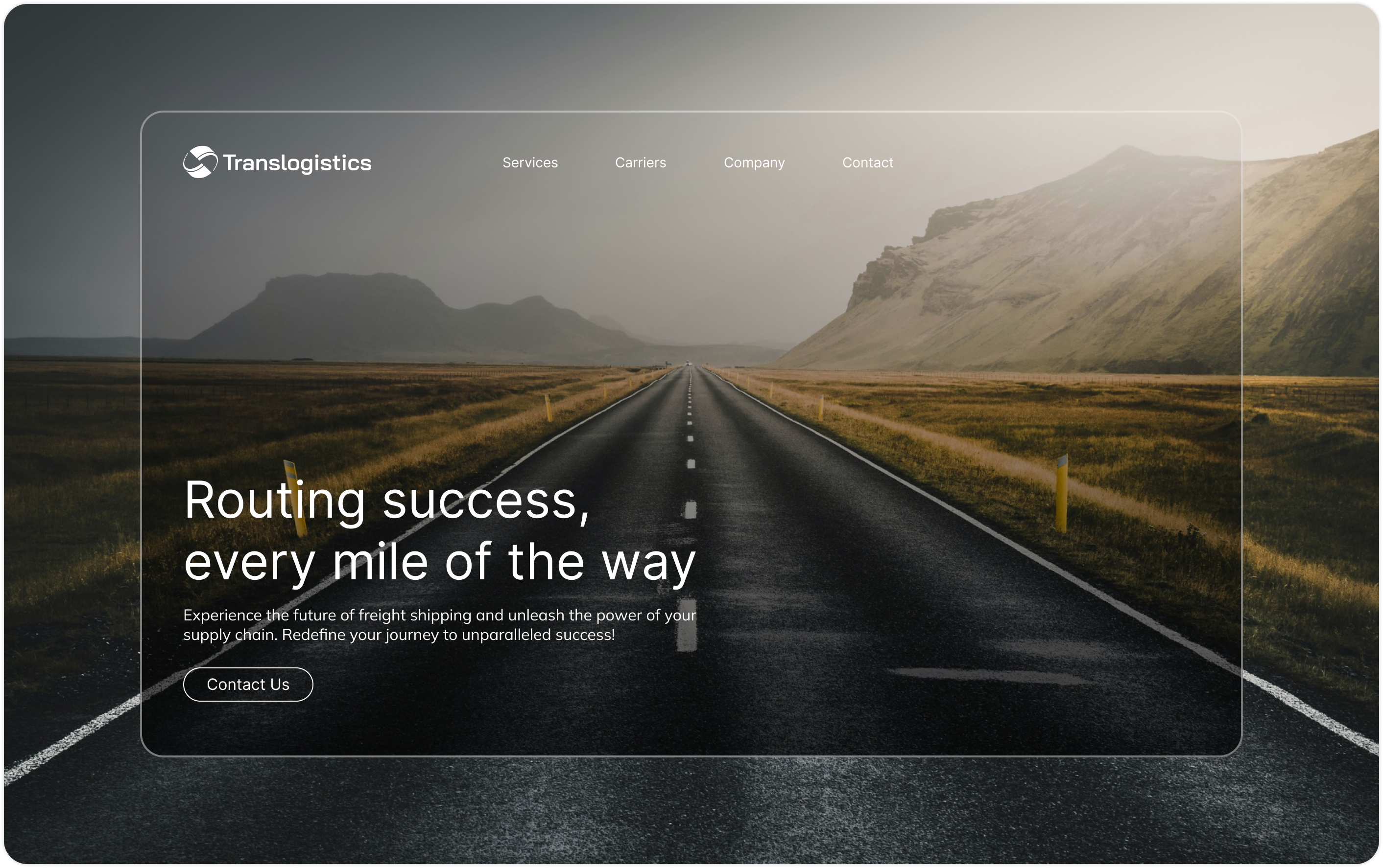
Journey from point A to B with Translogistics
CLIENT
Translogistics
SERVICES
Rebranding, Visual identity, Strategy, Responsive website design, Development
Logistics company in need of a voice
Translogistics is a key player in the logistics industry, known for its innovative solutions and commitment to excellence. Faced with the challenge of modernizing their brand identity and optimizing their logistics processes, they partnered with us to upgrade their brand and digital presence.
Our team dove headfirst into an in-depth analysis of the logistics industry, pinpointing key pain points in Translogistics' existing processes. We benchmarked competitors, scrutinizing their strengths and weaknesses, and scoured best practices from industry leaders to supercharge our approach.
This comprehensive research was vital in understanding the unique needs of their customers and drivers. We explored every nook and cranny of logistics operations, from supply chain management to last-mile delivery, ensuring a rock-solid understanding of the entire ecosystem. By gathering insights from industry experts and analyzing market trends, we crafted strategic recommendations tailored to Translogistics' specific challenges and opportunities. This foundational work set the stage for a transformative project aimed at turbocharging efficiency, boosting customer satisfaction, and propelling long-term growth for the company.
Logomark
Highway Logistics
Global
Mutual Success
Translogistics
Visual Identity
We redefined Translogistics' brand personality and core values, spotlighting trust, reliability, and innovation.
A classic touch into logistics
Translogistics wanted a standout brand in a competitive market that mirrors their commitment to excellence and forward-thinking. Our holistic approach kicked off with an in-depth analysis of their industry and target audience. We set out to craft a visual identity that not only grabs attention but also forges a meaningful connection with their customers.
The visual identity system was meticulously designed, featuring a modern logo that screams progress and efficiency. We chose a cohesive and classic color palette that exudes stability and trustworthiness—key traits Translogistics wanted to shine. The tech-forward typography reflects their innovative spirit and cutting-edge solutions.
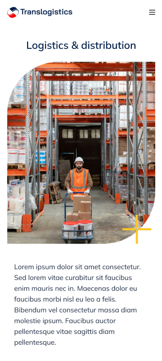
Beyond design elements, we integrated lifestyle imagery to humanize the brand, adding a relatable touch. Storytelling elements were seamlessly woven into the brand narrative to engage the audience on an emotional level, ensuring the brand's message hits home. By blending these elements, we created a compelling and cohesive brand identity that perfectly aligns with Translogistics' vision and goals.
Design approach
A clean and open view
The website got a bold makeover, with a sharp focus on information architecture and user flows, tailored for both customers and drivers. We kicked things off by mapping out detailed user journeys, pinpointing needs and pain points for both groups. This let us craft intuitive navigation principles, guiding users effortlessly through the site.
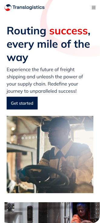
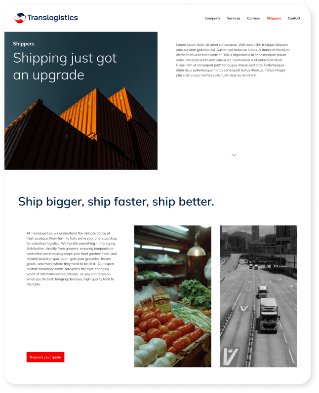
We rolled out wireframes and prototypes that highlight easy access to must-have features like booking services and real-time tracking. The visual design was opened up with a clean, modern look featuring an intuitive layout and rounded elements, perfectly syncing with our brand identity. Our choice of color palette and typography mirrors our refreshed brand image, creating a cohesive and striking appearance.
Taking user experience up another notch, we added more resources for easier access, including a beefed-up company section. We also amped up our brand presence with company culture pages and career resources, flaunting our values, team, and job opportunities. This not only reels in potential employees but also boosts our brand image. We made sure users can easily navigate through different site sections, with a laser focus on UX for lanes and services. Our content and messaging are on point—concise, digestible, and consistently on-brand, helping users find info quickly and enhancing their overall experience.
We emphasized responsive design principles, ensuring a seamless user experience across all devices, from desktops to mobiles. This comprehensive redesign addresses user needs and reflects their commitment to quality and innovation.
Experience the future of freight shipping and unleash the power of your supply chain.
Translogistics
We're not your average 3PL company. We're a technology-driven logistics partner committed to revolutionizing your supply chain.
www.translogistics.com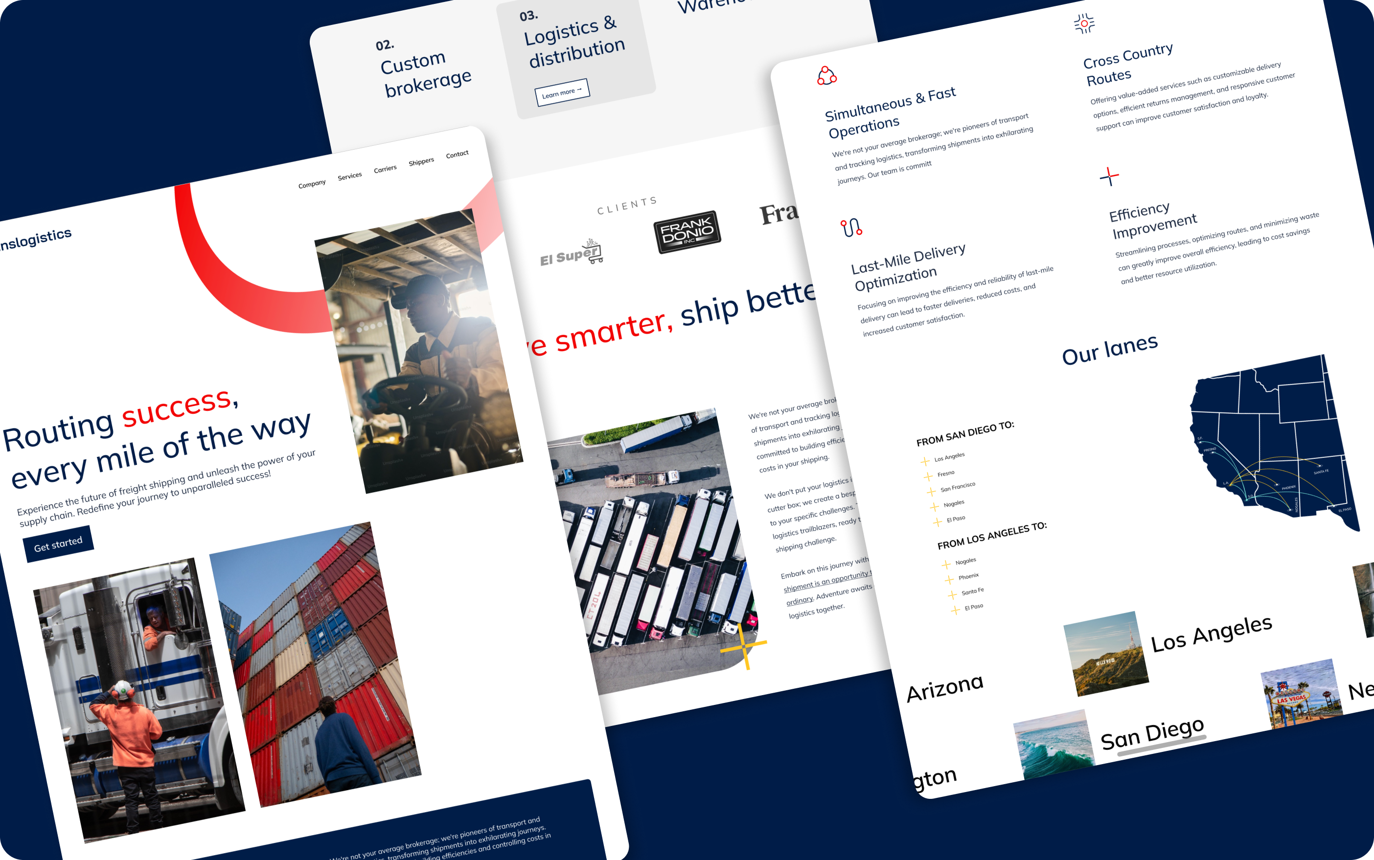
Development
Straight forward and seamless launch
Our team partnered closely with Translogistics during the development phase, ensuring a seamless handoff and smooth implementation. We conducted rigorous quality assurance and testing before deployment. Post-launch, we provided ongoing support to guarantee the new systems and website performed flawlessly.
Results
The results of our collaboration were nothing short of spectacular: boosted customer satisfaction through a killer user experience led to higher retention rates, while happier drivers enjoyed streamlined processes that ramped up their engagement and retention. On top of that the revamped brand identity that rocketed Translogistics' image, cementing its status as an industry trailblazer.
48%
Increase in customer retention
68%
Increase in customer engagement
54%
New leads